Creating movement. Capturing attention. Engaging audience. These are the goals of any successful website and 2015 was a year that proved to the marketing world that the best web designs are those with a compelling and dynamic user experience.
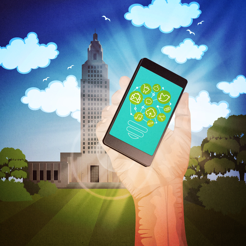
Arguably, the best user interactions are those that end with a conversion, which is why this past year saw a number of conversion-centric trends, including: full-width images, split-screen layout, video, optimized CTAs, card layouts, and more (see the following infographic for more details).

We have compiled a list of some of the best web designs of 2015 that not only look great, but feel great – and provide an interactive and intuitive on-site experience. Ignite inspiration for your website design by studying these pros then make 2016 your year of impact.
RawNet
It doesn’t take long when you arrive at this London-based digital agency website to fall in love with the compelling layout and aesthetically-pleasing design. The heavy use of a dark pink makes certain elements pop off the page and if the color is not enough to draw you in, the fact that practically anything clickable when you hover over it will either move, pop, change color, elicit a special effect – is enough to make you want to click around their site.
Apparently, we are not the only ones that have noticed the digital boundaries pushed by the RawNet website as this design has been featured on CreativeTimes, .Net Magazine, The Next Web and B2B Marketing and are currently nominated for a Webby Award in the ‘Best Visual Design – Function’ category.
RawNet has captured attention worldwide with their interactive website keeps users engaged.
Takeaway: Limiting the amount of colors incorporated in your website design does not equal boring, and RawNet’s acclaimed site design is proof.
Land Rover
Clean. Vibrant. Lively. These are some of the comments circulating about the web design and user interface found on Land Rover’s international website. Pushing digital limits, even the slideshow on the homepage of Land Rover is interactive with arrows that appear no matter where you hover over the image and animation that at first appears still but then comes to life.
The layout on site is clean and not overcrowded and still delivers a huge impact by using large high-resolution images. Car shoppers will find the shopping process easy with a side menu that is always on the screen that allows users to build a model, schedule a test drive, request a quote, calculate payment, or calculate trade-in value. Another compelling feature found on their homepage is a video created that tells the story of Land Rover, who they are, where and why they started, and how they got to where they are today. Well-done.
Takeaway: Full-width images alone give a website depth. Keeping the website layout relatively simple with the contrast of the large full-color images makes the interactive elements such as subtle arrows that follow your mouse when you scroll over the slideshow, really stand out and engage users on the site.
The Guardian
This world-renowned UK-based news resource has taken the user experience to a new level with their recent redesign that features the popular Pinterest-inspired card layout that delivers a little bit of everything at a glance and results in higher conversions.
Recognized by influential digital awards websites, the Guardian’s new design is a finalist for the Webby Awards for the ‘Best Visual Design – Function’ category. Notably, the interactive story of palm oil is the specific page nominated for the award. This page is it’s an interactive journey that uses incredible video, photojournalism, data visualization, and audio. that allows the user to engage in the history of palm oil supply chain and the importance of this issue.
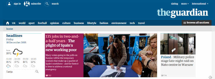
Redesign of the world-renowned Guardian news site is making its own headlines for web redesign.
Takeaway: New Pinterest-inspired card layouts are a great way to give the user plenty of options at once while delivering an eye-catching design that pulls the user in for more.
Google Photos
Taking interactive and functional to a whole new level, Google Photos’ redesign now makes it easier to share, organize, edit, and manage your photos. Learning more about their new user interface, the about page features a scrolling layout filled with slideshows, videos, GIFs, movement, and other dynamic effects to capture your interest.
New editing features are very advanced and include the capability to create your own interactive movement images (GIFs) by uploading a series of five or more images that are then played in sequence. Want to really optimize your image experience? Take a collection of photos and turn them into a professional quality video that is set to a music soundtrack to amaze your family and friends. Google doesn’t quit there, they are also incorporating their Google Maps technology to create a real interactive slideshow where your pictures appear with a marker on a map of where they were taken accompanied by text for the ultimate interactive timeline.
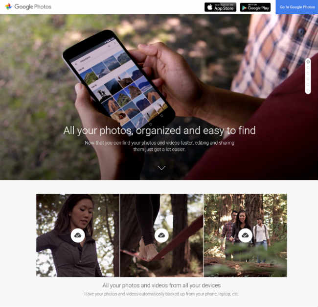
Google’s latest redesign for their Photos app shows off the advanced features that can help users manage photos and bring them to life.
Takeaway – Not only did Google set a precedence in web design with this new layout, the easy-to-use advanced features make it possible for anyone, including the average small business owner to create movement and compelling media from existing photos.
Paul Stuart
Rocking their site by using a combination of several high-converting techniques for web design of 2015 according to the above infographic, the Paul Stuart website design creates an impact. Eye-catching images on a split-screen layout give the user options of where they want to navigate. Other trends on this website include the use of single-column CTA and Pinterest-style card layout.
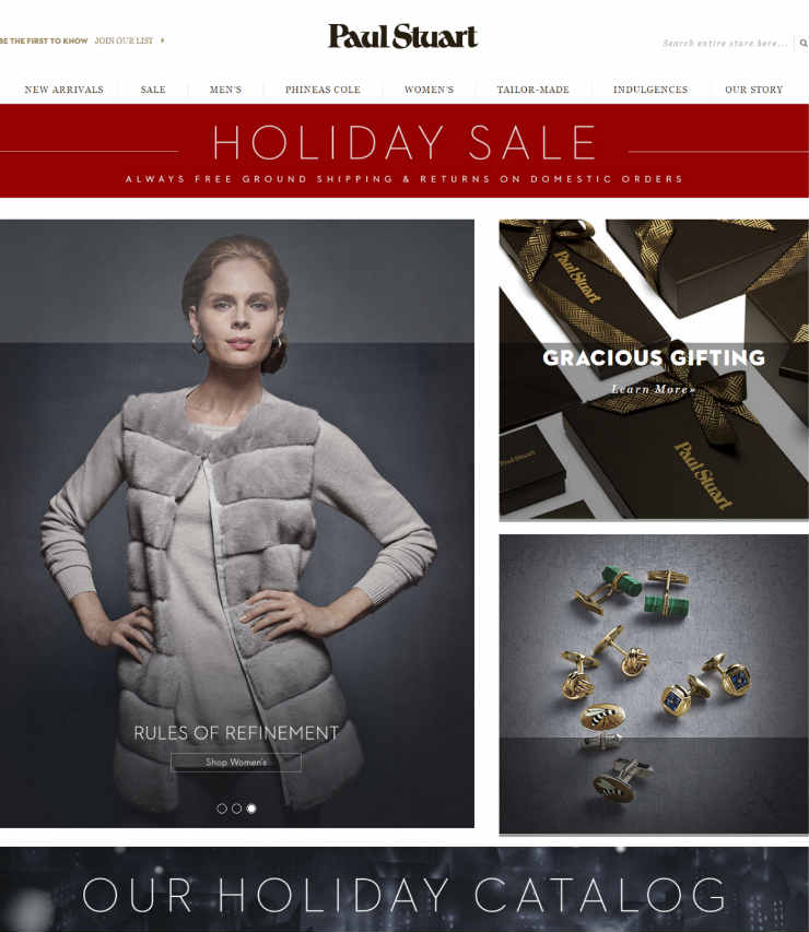
The side-by-side images on this page give users options where to go, but not too many at a time.
Takeaway: Give users on your site options side-by-side, but not too many at a time. Limit the choices of navigation to the top level pages because too many options at once can decrease likelihood of conversion.
How is your website prepared to handle the trends of the future? What kind of experience can a user expect when they land on your pages? If you need help making your visions a reality for your 2016 web design, call or email us today. Our passion is helping companies in Houston maximize their budget to get the best possible results from their website designs.

Leave A Comment