Web design is one of the most crucial factors that needs to be properly executed in order to create a winning digital brand for your business. If your website fails – visitors will run from your site faster than they would a plague.
We set out on a mission to pick some small businesses in Houston with the most attractive website designs that leave users begging for more. Here are ten small business websites that we love in order from our top pick down:
What we love about the design: Jonathon’s The Rub website features modern design elements aimed at increasing conversions which is one of the reasons it made our number one position on this list. On the top level menu for the website, the “Make a Reservation” tab is singled out by its bright red box frame. The use of full-width images on this website broken up with copy and other design elements delivers a strong impact with enough balance that it’s not overwhelming.
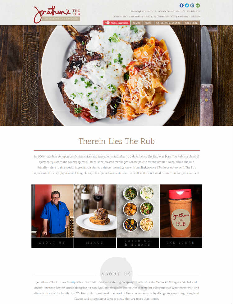
The website of this family-owned restaurant and catering service engages the senses with its vibrant and flavorful images.
Takeaway: When users are provided too many options they are less likely to convert. Show users where you want them to go by drawing attention to the tab you want them to click on.
2. Boheme
What we love about the design: When you arrive at the Boheme website, immediately you are engaged by the attractive video rolling in the background that sets the stage for what it’s like to be at their location. A combination of carefully selected video and music beautifully illustrates Boheme’s digital brand.
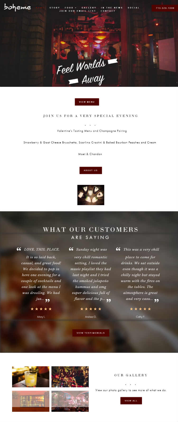
The Boheme website makes the number two spot on our list of attractive Houston small business website designs.
Takeaway: Video can be a powerful element when skillfully positioned on your website. Keep in mind your page loading time will be affected by a video background, but the effect is usually worth the sacrifice.
3. Two Be Wed
What we love about the design: You have probably heard the buzz about telling a story with your online content. It’s precisely this story-telling element that made us choose the Two be Wed website as number three on the list. The homepage on this website features a layout coupled with clever copy that helps tell the story about the company and how they can benefit you.
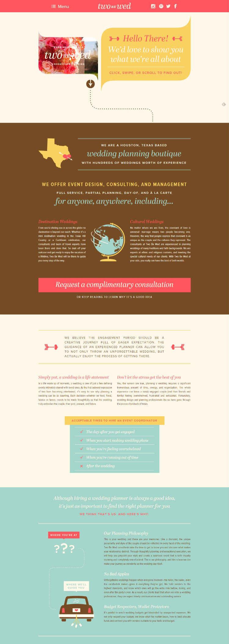
The Two Be Wed website design takes you on a journey through their layout with transitional elements and a “road map” design.
Takeaway: The power of story is a well-known and highly effective marketing technique. Incorporate your company’s story or the buyer’s journey whenever possible to create a lasting impression.
What we love about the design: What’s not to love? The beautiful sunshine header of the Breakfast Klub website is very attractive and effective at drawing the viewer in for a closer look. The website features full-width high-resolution images that are sharp and really help establish the brand identity of this company by featuring their most unique dishes that are signature for the restaurant: “Wings and Waffles” and “Katfish and Grits.” Taking the “K” in “Klub” another step further, the website copy replaces all “c”s to “k”s – and they pull this off brilliantly.
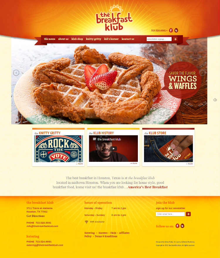
The Breakfast Klub website combines some of our favorite elements including large vibrant images, an exciting mix of colors, and original touches.
Takeaway: Creating something unique on your website that stands out if a great way to make a lasting impression.
What we love about the design: The website for AJ’s Lawn Care stands out with its modern elements that many competitors in this industry are lacking. The full-width grass image used in the header is simple and elegant with a “back to nature” feel. The “Get a Quote” call-to-action (CTA) button is in a column by itself which helps increase the likelihood of conversion.
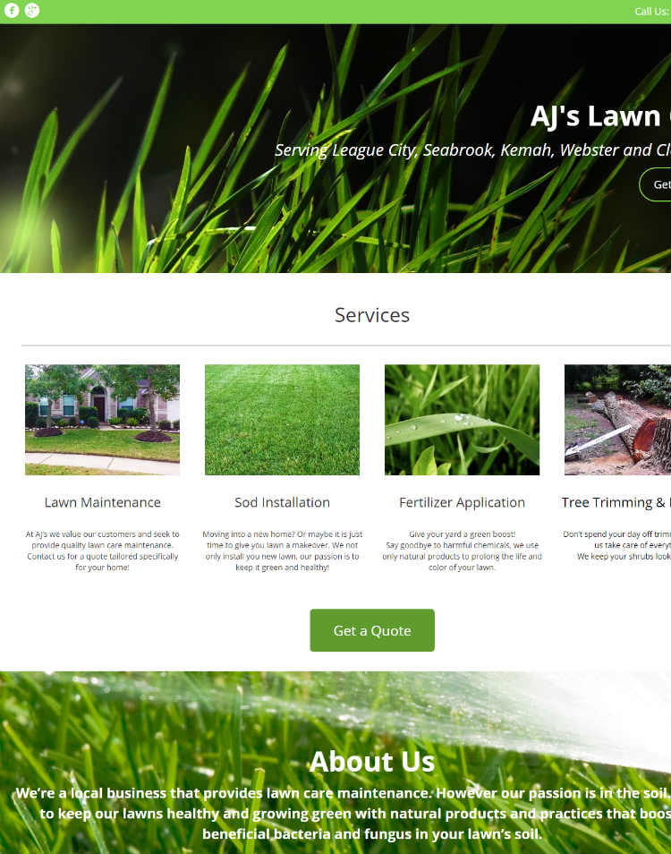
AJ’s Lawn Care website really stands out of the pack with a modern website not always seen in this industry.
Takeaway: A CTA in a column by itself is more likely to be clicked because you have eliminated any distractions from side bars or other website elements.
6. Niko Niko’s
What we love about the design: This family-owned Greek restaurant features a beautiful website that uses one of our favorite design elements – a Pinterest-inspired card layout.

The Niko Niko’s website will make your mouth water with the delicious-looking food and the card layout gives you plenty of options where to click.
Takeaway: The trick to pulling off this design is to give users options where to click, but limit it to about three per column at most.
7. El Bolillo
What we love about the design: It’s simple but delivers a high impact. The layout features a minimum use of color with directs your attention to the attractive images. Keeping the user engaged, the subtle movement of the image as you are looking at it creates depth and tells their story through imagery.

El Bolillo Bakery has a website that literally draws you in and makes your mouth water! Talk about engaging.
Takeaway: Big images are in, in case you haven’t heard. It can be a tricky balance to feature large full-color images without making a website too busy. El Bolillo’s simple layout pulls off this balance beautifully.
What we love about the design: The Rice Village Diamonds website is simply stunning. The website uses contrast and variety to achieve this impact. Not to mention the products offered by this company are gorgeous, so they take advantage of this by including up-close imagery that really creates an impact for their brand identity.
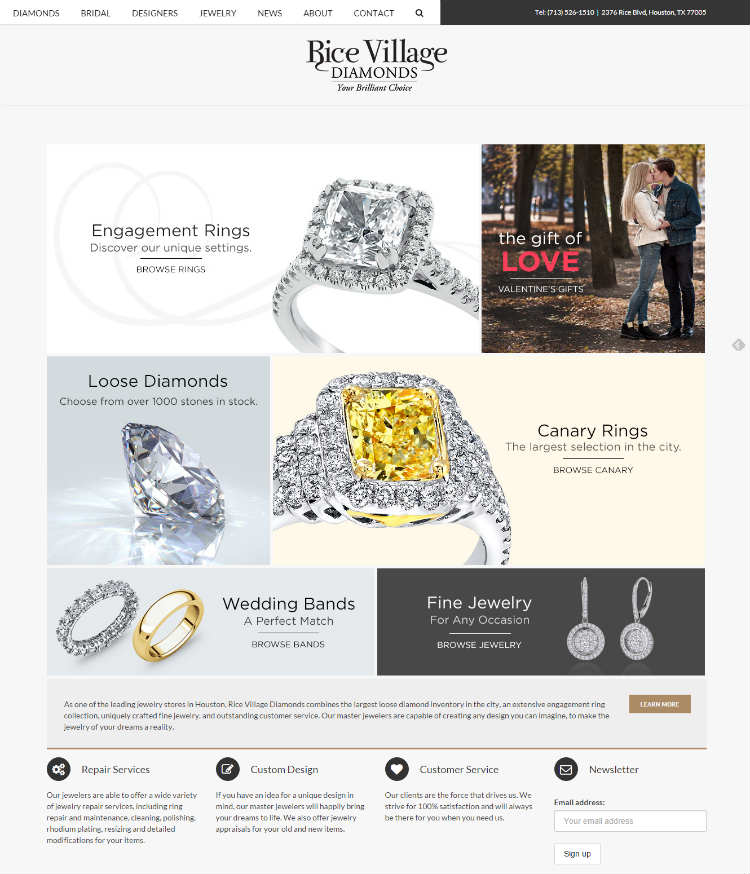
Rice Village Diamonds website offers users many options where to click to start their journey.
Takeaway: Pictures of your actual products are very effective on your company’s website. It’s well worth it to hire a professional photographer to capture high-quality, professional images.
9. Okra
What we love about the design: Easy does it. The Okra website is simple and modern. The full-width image in the background sets the scene of what the atmosphere is like at their saloon. The fact that this company gives a certain amount of profit to charity is one of their unique value offerings which is stressed on the website to increase brand awareness.
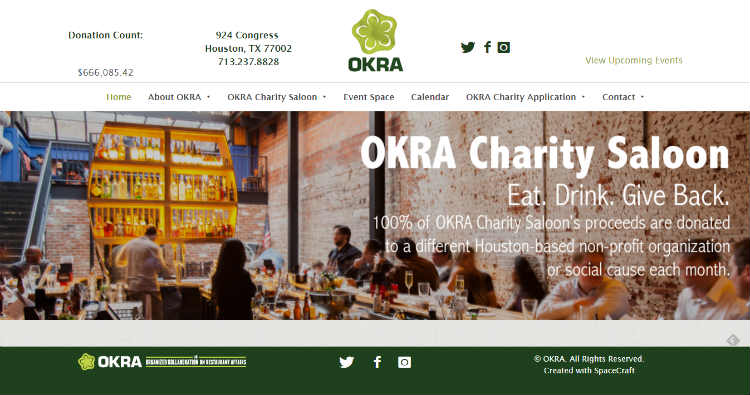
The Okra website is simple, tasteful and clearly conveys the branding message of the company.
Takeaway: Anytime you have a unique value offering, this needs to be stressed and clearly conveyed throughout the copy and design of your website.
10. Ventura’s
What we love about the design: There is a lot going on with this design, but the subtleness of the image background mutes the activity to provide an elegant and simple look. Vibrant images set against this textured background coupled with a shadow effect makes them stand out from the page.
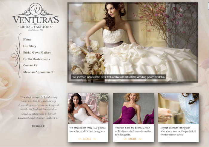
Ventura’s Bridal Fashions website has subtle touches that create a stand-out appearance.
Takeaway: Modern websites are taking advantage of offering users more than one place to navigate from the home screen. Card layouts add variety and keep your eyes moving on the page.
Our passion is helping small businesses achieve their digital marketing goals within their available budget. If you feel your website needs a facelift in order to help establish your digital brand identity, reach out to us to today for a free quote. We can’t wait to hear from you!


Leave A Comment